
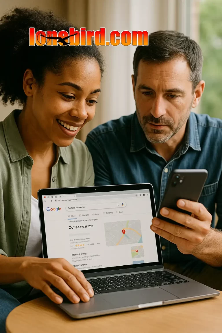
Most of Your Customers Are on Their Phones — Is Your Site Ready?
If your website was designed with desktops in mind, you’re already behind. Today, more than 70% of online traffic comes from mobile users — and Google now ranks sites based on their mobile performance first.
In short, if your site doesn’t look and load great on a phone, it’s invisible.
What “Mobile-First” Really Means
Mobile-first isn’t just about shrinking a desktop layout. It’s about designing from the smallest screen up, ensuring that your content, menus, and calls to action work naturally on phones.
A mobile-first site loads faster, is easier to navigate, and focuses on what users want most — quick answers, tap-to-call, and simple forms.
Why Mobile Design Matters
1. Google Prioritizes Mobile Performance
Google switched to mobile-first indexing, meaning your site’s mobile version determines its ranking.
2. Users Won’t Wait
If your site takes more than 3 seconds to load, half your visitors leave. Mobile-first design means lighter code and faster response.
3. Tap-Friendly Navigation
Menus, buttons, and forms need to be designed for thumbs, not mice. Simplicity wins on small screens.
4. Conversions Come from Convenience
The easier it is to call, book, or buy from a phone, the more customers you’ll convert.
Designing for mobile isn’t just a trend — it’s survival. A mobile-first site puts your business where your customers already are: in their hands, wherever they go.
If your website still looks best on a desktop, it’s time for a change.
Partner up with Lone Bird Studio.
We’ll design a mobile-first experience that loads fast, converts better, and makes you stand out.